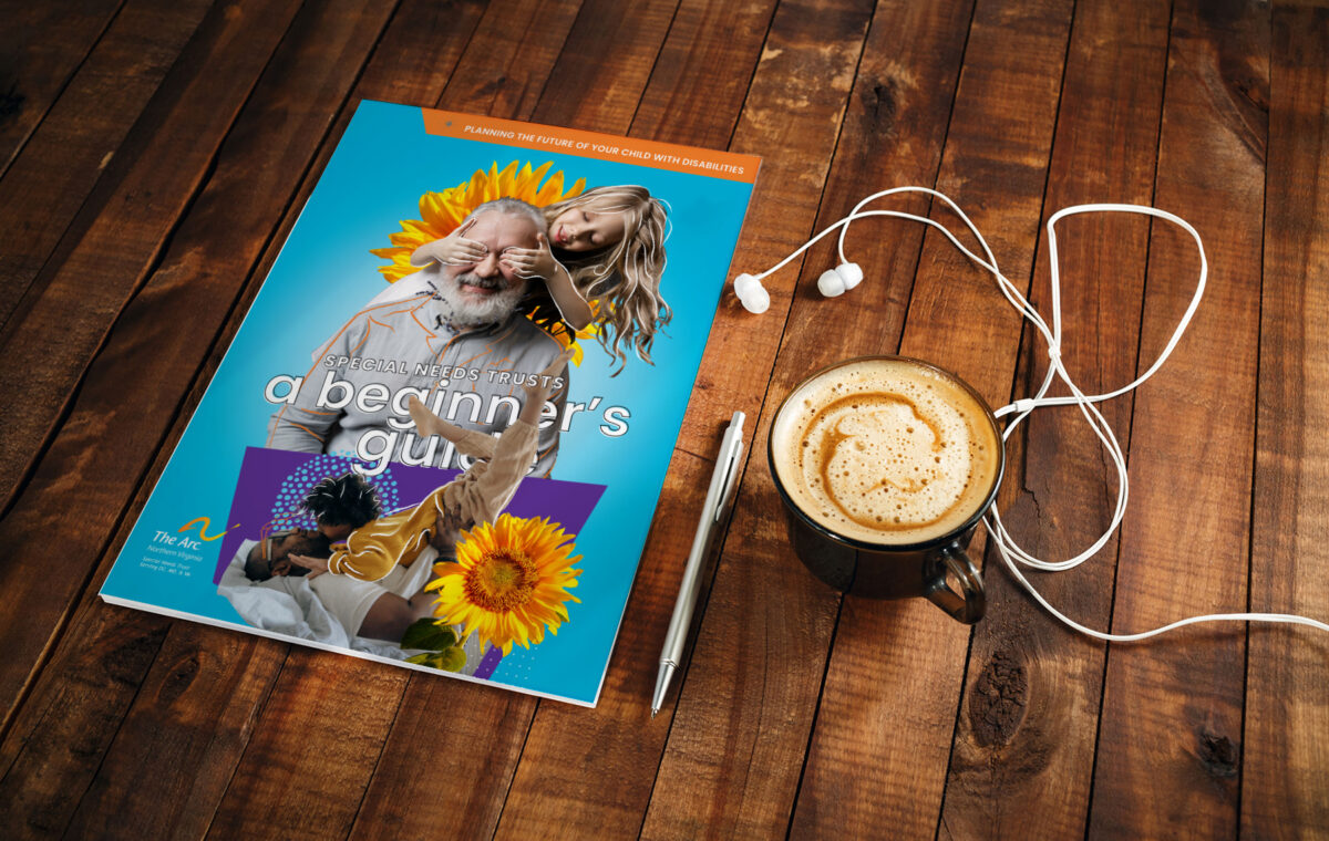
The Arc of Northern Virginia’s Special Needs Trust Guidebook and collateral
DESIGNED: Information-focused booklet for the Non-profit based in Virginia.
The Arc of Northern Virginia asked MadWerkz to design their Special Needs Trust brochure, A Beginner’s Guide. Designed to teach families and their loved ones about Special Needs Trusts, the booklet will assist The Arc in supporting thousands of families with members who have intellectual and developmental disabilities.
The challenge for MadWerkz in designing A Beginner’s Guide for The Arc of Northern Virginia was to create an informative deliverable that would provide the detailed content a Special Needs Trusts demanded while presenting a fun, visually engaging tapestry tuned to the Social Media Age.
Tweet
The Arc of Northern Virginia’ (ArcNOVA) mission is to promote and protect the human rights of people with intellectual and developmental disabilities as well as actively support their participation in the community. With a rich history that goes back 60 years, ArcNOVA has been a guiding beacon that provides families with comfort and stability.
“We wanted something fun, however, it needed to deliver the goods. The journey of A Beginner’s Guide had to make sense. They (MadWerkz) listened and delivered something that exceeded all of our expectations.”
Tia Marsili,
The Arc of Northern Virginia – Director of Trusts
The creative challenge
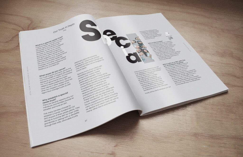
Any document explaining the process of constructing a Special Needs Trust is bound to be heavy on content. The communications team at ArcNOVA knew they needed to walk a fine line—impressing readers with entertaining graphics, while not distracting them from its information-sharing purpose. The journey had to make sense, they thought.
Level Up Your Brand.
Good Design is Universal. From film to paper, Do The Good and the rest will follow. Level up your brand, call MadWerkz today.
“It’s truly a pleasure to work with clients that challenge you to stretch… I designed several cover concepts, and we ended up using all of them in one way or another.”
Joddy Eric Matthews,
Creative Director

The creative journey
Empower, the annual magazine MadWerkz had designed for ArcNova in 2018 gave them insight into ArcNOVA’s needs and wishes for a dense document like the guidebook. “It’s truly a pleasure to work with clients that challenge you to stretch.” stated the project’s Creative Director, Joddy Eric Matthews. “After meeting with Karyn Tan, the Project Lead at that time, I designed several cover concepts, and we ended up using all of them in one way or another.”
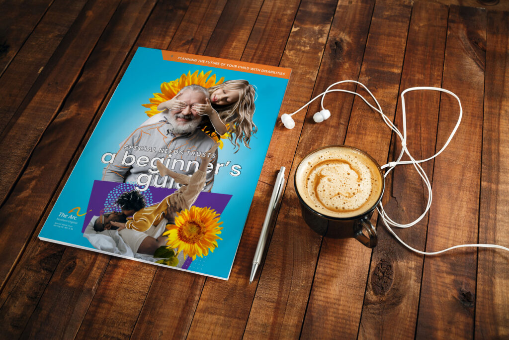
Joddy designed the covers around Pantone 312 CP, or as we called it Amazon Echo Blue… He would be on the Zoom calls just holding this box.
Jason Mitchwell, Lead Designer
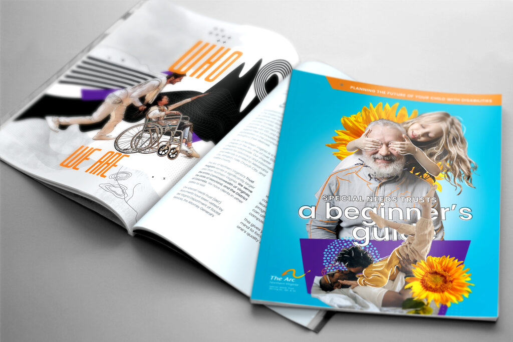
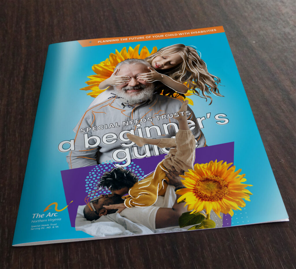
The cover used ArcNOVA’s branding and messaging that said, “This is a fun, not arduous or cumbersome experience”, remarked Project Lead Christopher Kennedy. Indeed, the use of hand-drawn illustrated lines over the rotoscoped photography, in-your-face colorized sunflowers Pantone tuned to Arc’s branded yellow, and the playful images of adults with happy children very much gave it that Tik Tok look. “Joddy designed the covers around Pantone 312 CP, or as we called it Echo box blue, quipped Jason Mitchwell, the lead designer. “He would be on the Zoom calls holding this box. We asked what it was for and he stated it was the cover color!”
“We wanted a coffee table cover that asked to be picked up” added Kennedy. Pantone CMYK colors printed on glossy paper stock with an aqueous coating brought the cover to life, giving A Beginner’s Guide a great look and feel.
The creative strategy
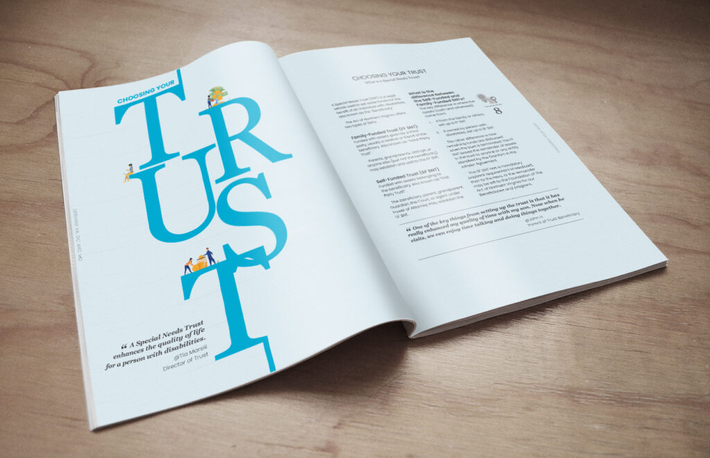
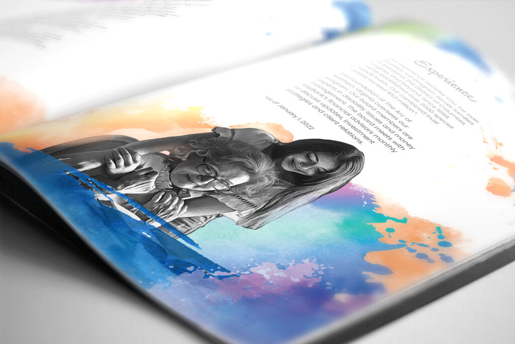
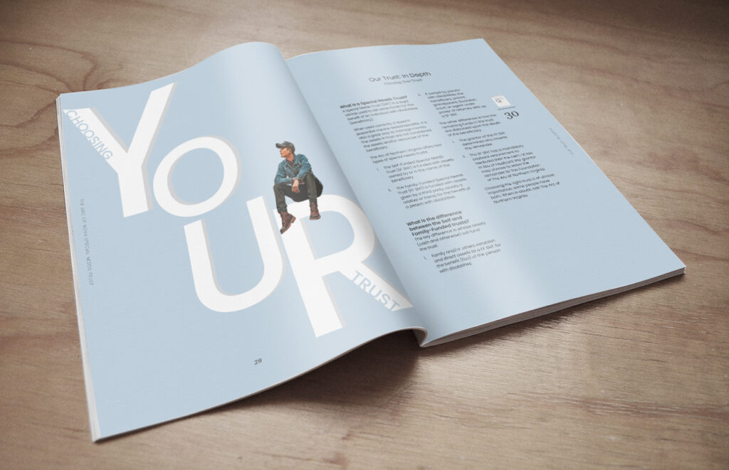
To meet expectations, the solution ended up being a booklet that sported unique designs for every chapter. Designer Jason Mitchell started with a custom vectorized palette for the imagery. “We started with a retro vectorized Photoshop script on the photos. Once they were approved by Tia, they got the treatment. We varied the script based on the images, to make sure they didn’t look too cartooney”, Mitchell stated.
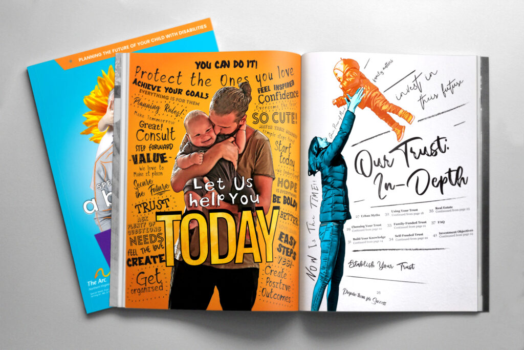
Kennedy used a large amount of graphics across the guide’s thirteen chapters which allowed the guidebook to entice readers without burdening them with paragraph after paragraph of content. With Matthews and Mitchell producing new designs to challenge boundaries on each page, Kennedy set forth using ArcNOVA’s company colors as a base, creating various shades of orange, purple and blue, based around Pantone 312, 158 CP (Orange), and 2597 CP (Purple) to help key content jump off of the page and stand out to the reader.
The results of our guidebook work
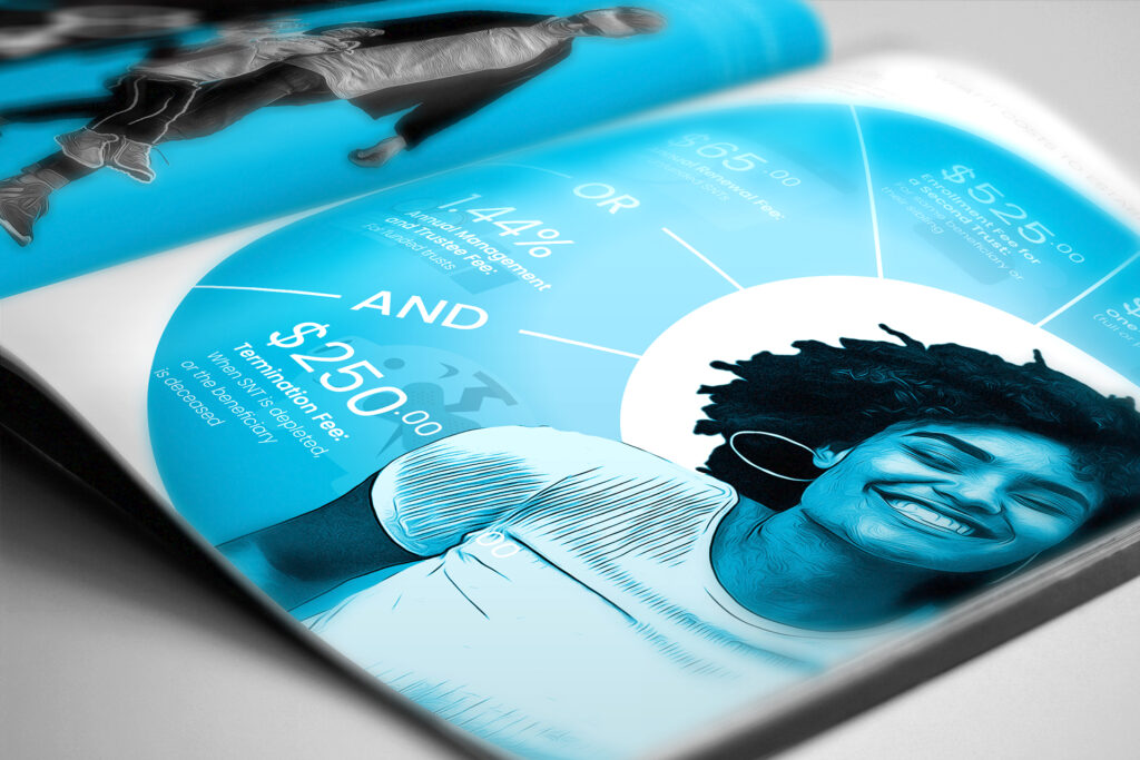
After 2 years in development, the final result was a highly stylized, 11×17 stitched, Pantone printed Forty-Four-page booklet. Some pages employed hard-hitting graphics (such as infographics, maps, and even a board game layout) while some required a more subtle, content-based touch, with a minimized layout, highlighting negative space to get the information across. Overall, the client’s reception of the guidebook has been very positive and our team is proud to have been a part of this project.
To learn more about ArcNOVA and the services that they provide, you can visit their website here.
Project Notes:
Client: The Arc of Northern Virginia
Project Director: Tia Marsili
Project Lead: Karyn Tan, Rob Hudson
Project Lead: Chris Kennedy
Creative Director: JEM
Layout: Chris Kennedy
Designers: Jason Mitchwell, Kai, JEM
Illustration: Kai
Studio: MadWerkz


