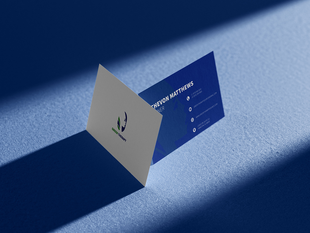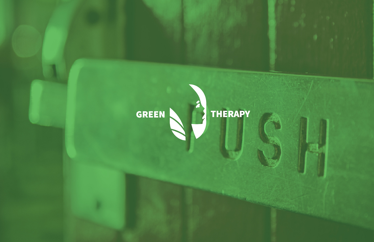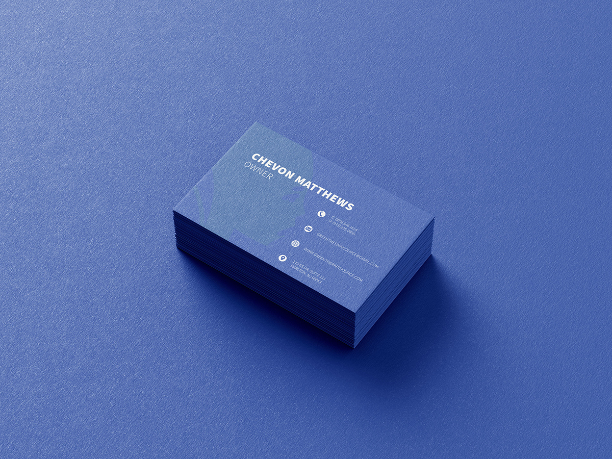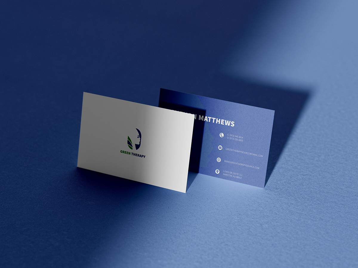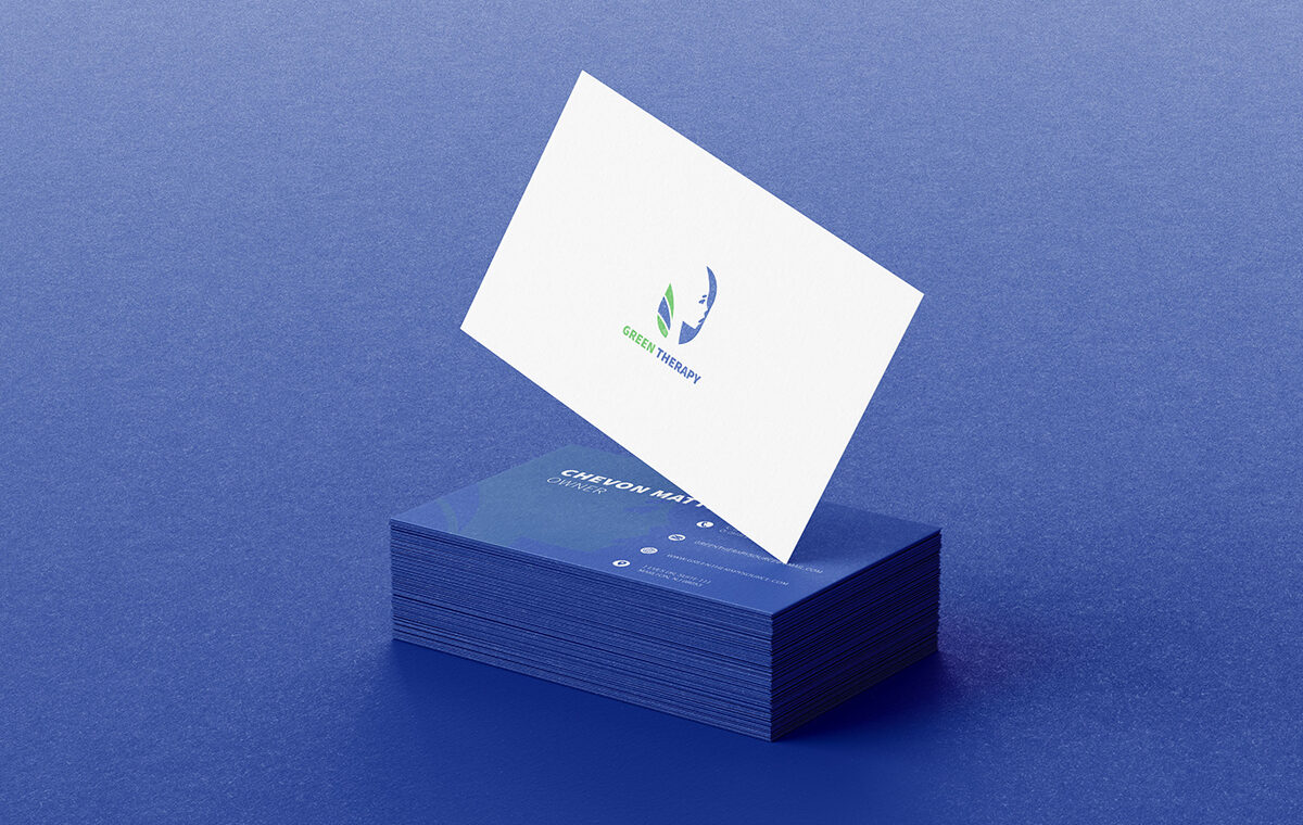
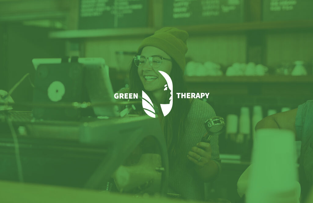
Green Therapy is a company that provides awareness to the benefits of premium natural products as an alternative to pharmaceutical therapies through the sale of cannabis products.
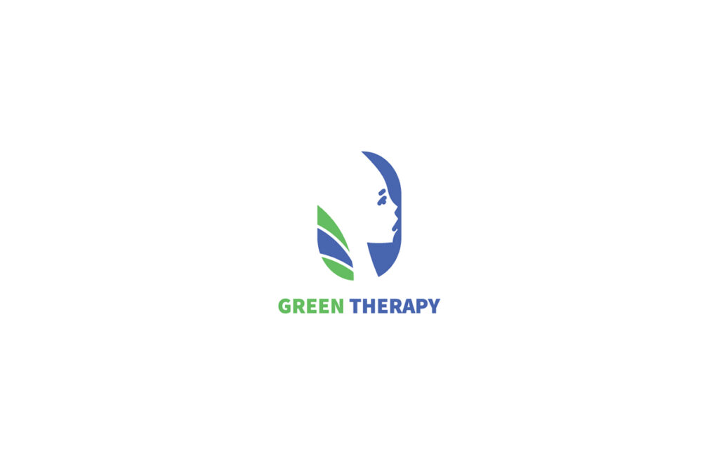
For their brand, the client wanted to use bright green and blue as the colors that evoke trust and care. The client wanted the logo to represent wellness and to connect with her clientele, minority women. Since Green Therapy sells CBD products, MadWerkz designer, Anthony Connor, produced a brand logo that included a leaf within the design. The test was balancing so that the leaf did not overpower the entire design.
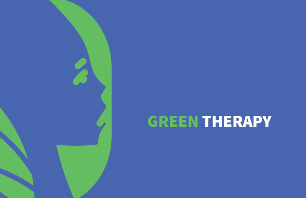
The type that was chosen is Source Sans Variable Black. A font that is well balanced and complements the design. The main focus of the design to be the head of the woman looking into the success of her future.